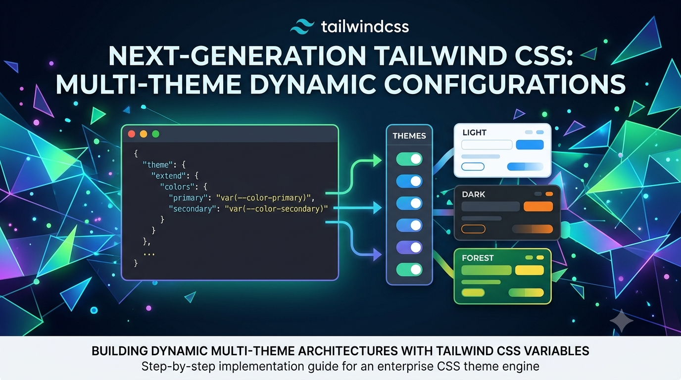
Next-Generation Tailwind CSS Multi-Theme Dynamic Configurations
Step-by-step implementation guide to engineering an enterprise CSS theme engine using Tailwind CSS and native CSS custom properties.
Frontend Architecture
Engineering Multi-Theme UI Architectures via Tailwind CSS Variable Tokens
UI Engineering • 8 Min Read
Why Hardcoded Color Utilities Fail in Enterprise Products
Relying on hardcoded utility declarations like bg-blue-600 dark:bg-slate-900 restricts your application to simple dark mode variations. If you need to support white-label branding, customized client palettes, or user-controlled interface profiles, hardcoded classes create heavy code duplication. Mapping Tailwind utilities to dynamic CSS variables lets you safely swap global look-and-feel states at runtime using a single parent data attribute.
Configuring Tailwind to Read Root Theme Custom Variables
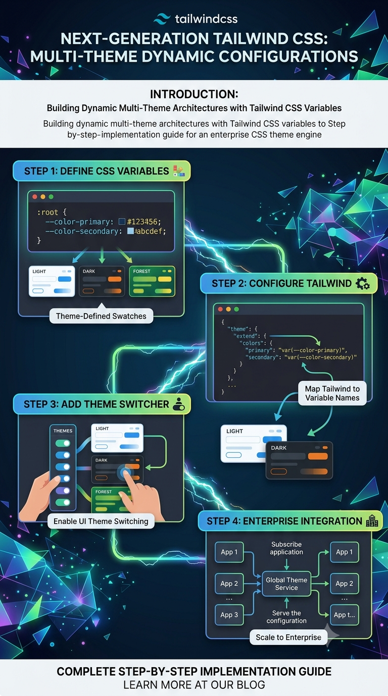
Define your design choices as bare RGB value strings inside your CSS layer. This lets Tailwind's opacity modifiers (like bg-primary/50) continue working flawlessly across different color choices.
Tailwind Engine Configuration Block
// tailwind.config.js - Extends theme properties to leverage native CSS custom variables
module.exports = {
  content: ["./src/**/*.{html,js,jsx,ts,tsx}"],
  theme: {
    extend: {
      colors: {
        panelBg: 'rgb(var(--color-panel-bg) / <alpha-value>)',
        brandText: 'rgb(var(--color-brand-text) / <alpha-value>)',
      },
    },
  },
  plugins: [],
}
Design Token Hint
Declare your default theme fallbacks under the :root element in your main CSS stylesheet. To swap layouts instantly, simply update the DOM element attribute to data-theme="dark" using JavaScript.
Leave a comment
Your email address will not be published. Required fields are marked *